One of these covers does not belong
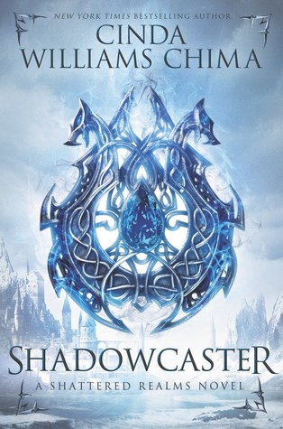
I think I wrote last week that something about Shadowcaster’s cover was bothering me. I finally figured out that it didn’t match the other pictures in the series. I pulled out all of the books this weekend to take a pretty picture of them (not this one, this was just a quicky) and that was when it hit me what was wrong. I think I knew it in the back of my mind, but I was so entranced by this new cover that it didn’t jump out at me until now. So I started thinking WHY!! I know I saw a cover that matched at some point so I went to Cinda’s website to double check and yep they had a cover reveal last summer showing this as the cover:
 This one is so much prettier and matches the others so nicely. Cinda wrote this about the covers:
“My agent says that this is his favorite cover yet. It’s got some awesome competition, but it’s definitely a contender. Sasha Vinogravida, the illustrator, and Erin Fitzsimmons, the designer, have outdone themselves.
As in Flamecaster, the central motif is a magemark, which is a kind of an amulet embedded in the skin of a handful of the gifted. It’s still a mystery to those who carry them. All they know is that the Empress in the East is hunting them, and they’d better not get caught!
The landscape in the background is Chalk Cliffs, the queendom of the Fells’s only deepwater port, where much of the action in Book 2 takes place.
I hope you like the cover as much as I do!”
Yes I do! So why the change? I think it was because of this:

The paperback version matched the kindle version so my guess is that the kindle version of the book was seeing better sales so the publisher decided to go with a look that matched that cover instead of all the rest. The paperback cover came out a month before the second book, so I don’t think the sales would have influenced the decision. Now I do like the new Flamecaster cover, but … I still really prefer the original. I saw someone on Goodreads saying that they thought the cover change was so that it looked more like the Throne of Glass series. That could be it too. As far as I can tell Cinda did not make a final announcement about the cover change, so I don’t know what their thought process was.
So while I was mulling this over I came across this cover image for the second book in the Beautiful Idols series by Alison Noel:

A totally different look from the first book:

But it matches the paperback and many of her other book covers, so maybe that is why they changed it. I loved this cover, it was one of the reason’s I picked up the book. I think that is why I missed the second book when I went book shopping a couple of weeks ago. It just didn’t match what I thought the cover would look like. Oh well, I will try not to let the cover disappointment keep me from enjoying the book.
So I would love to hear your thoughts on these book covers and others that were changed that you didn’t like. I know publishers often change covers from hardcover to paperback, but still it shouldn’t be such a dramatic change.

Whoa, those last two are in the same series?! Believe it or not, I have a similar post written about how it annoys me when books in the same series don’t follow the same kinda look! And it’s especially frustrating when I really like the way the first cover(s) looks and then it gets changed to something worse. So I definitely agree!
LikeLike
It is so frustrating. I don’t know if the publishers just don’t get it or don’t care that much. Thanks for the comment.
LikeLike
I don’t like the new cover changes at all. It seems that badass warrior woman is the new popular cover, and the thing is that when they first came out (throne of glass too) they were cool. But the more covers that follow this format the less meaningful it is. The original covers to all Seven Realms books were beautiful just as they are.
LikeLike
I totally agree. While I do like the badass look, I also like the simpler symbolic ones. I like to image what the characters look like in my head, not have it dictated by the cover. I also keep thinking that the girl on the cover doesn’t really match the description given for Lyss. Thanks for the comment.
LikeLiked by 1 person
Actually I hate cover changes. I consider myself a collector (as all of us are), and it annoys me when the covers don’t match. SO I usually wait for the whole series to come out before buying my copies. 🙂 🙂
LikeLiked by 1 person